
The technical performance of your website has a significant impact on several critical areas. From user experience to SEO, ensuring your web performance scores are best in class is essential for meeting your brand and commercial goals, but getting there needs a well-considered strategy and an agency that understands the how and the why.
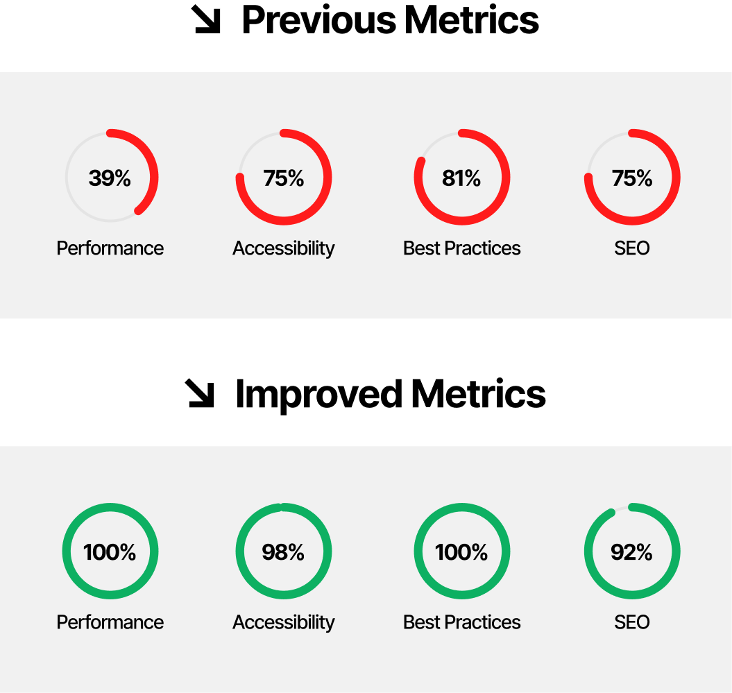
We recently took a leading-enterprise level client on a journey of improvement, taking their performance score from a worrying 39/100 to a perfect 100/100 (Lighthouse and PageSpeed Insights).
Learn about our approach to web performance, tools and techniques that achieved the following results.
In this article, we share our motivations for wanting to develop a faster web experience, how we delivered it, what helped us move fast, and the impact it had on the user.
The Challenge
Many of the websites we come to support have been through multiple design iterations, new components and new layouts created by different designers with different visions for web UI and driven by then current trends. Sometimes new features and new functionality have been developed on top of a codebase that was already bloated and hard to maintain.
Looking at this particular large scale project as an example, the site originally needed to support Internet Explorer 8 due to internal business systems relying on the ageing browser. This meant features detection delivered via Modernizr, media query polyfill via respond.js, as well as icon fonts, jQuery and a few other things were all required – all elements that a present day website shouldn’t need.
Even though with new features development we’d already introduced small code refactorings that made improvements in a few areas of the site, it was a way off what we really wanted to achieve.
The home page, for example, was loading 246kB of CSS, 174kB of JavaScript, 598kB of fonts, and the biggest bottleneck – 4.6MB of images, but we knew exactly where most of our work would need to focus as, including all the third-party resources, the home page weighed 9.4MB.
This example website has more than 1,000 pages, showcasing business activities, products and news about the company, and all of its sub-brands. Pages like the home page, product listings, and news & media were very important to the client for many reasons, including:
They are an important source of organic traffic with a steadily increasing number of users coming from search engine results.
They have high conversion rates in the medium to long-term compared to other pages.
However, there were challenges when it came to the performance and user experience in these pages:
Their performance was not well-optimised, and there were known issues regarding slow page load, slow responsiveness to user input, and layout instability.
Their bounce rates were high, even if we expected them to be higher than in other parts of the website.
The page experience update in Google Search, which at that time was not yet released, would include Core Web Vitals into the ranking algorithm, which meant page performance could affect how search results were going to be displayed.
At the same time, we identified some developer experience opportunities that could unlock gains in other projects across the company:
Our Sass-based stylesheets architecture was completely custom, without a real developer and development-friendly structure allowing the website to scale without too much effort.
Our JavaScript wasn’t well modularised and was getting bundled into one huge file that we were serving for every single page, even though many pages didn’t require most of the functionality included in the file. Essential features to achieve good website performance, such as code-splitting, were becoming a must.
Our solution
We felt that starting from scratch was the best option to improve not only the developer experience when it came to adding new features to the website but, more importantly, to make the website faster and improve performance.
This opportunity was possible by introducing a new look and feel to their website.
A company’s website is frequently the first place where new visitors will discover and learn about a business and its products. We always aim to deliver a satisfying experience because performance is connected to user experience.
Our Approach
To do this, we designed a new performance-first web experience. We created completely new architecture for the frontend, based on current best practices, future-proofed with trending techniques, and built with a mix of methodologies like ITCSS, OOCSS, SMACSS and BEM for the CSS architecture, modular JavaScript bundled with Webpack (that will only load functionality for the current view), and a fail-proof solution for images loading built with Cloudinary.
We removed all the dependencies that no longer made sense within the new build. We dropped jQuery in favour of vanilla JavaScript, replaced icon fonts with SVG icons bundled in an SVG sprite, and got rid of Modernizr and media query polyfill.
Creating pages that load faster:
Adopting part of the PRPL pattern
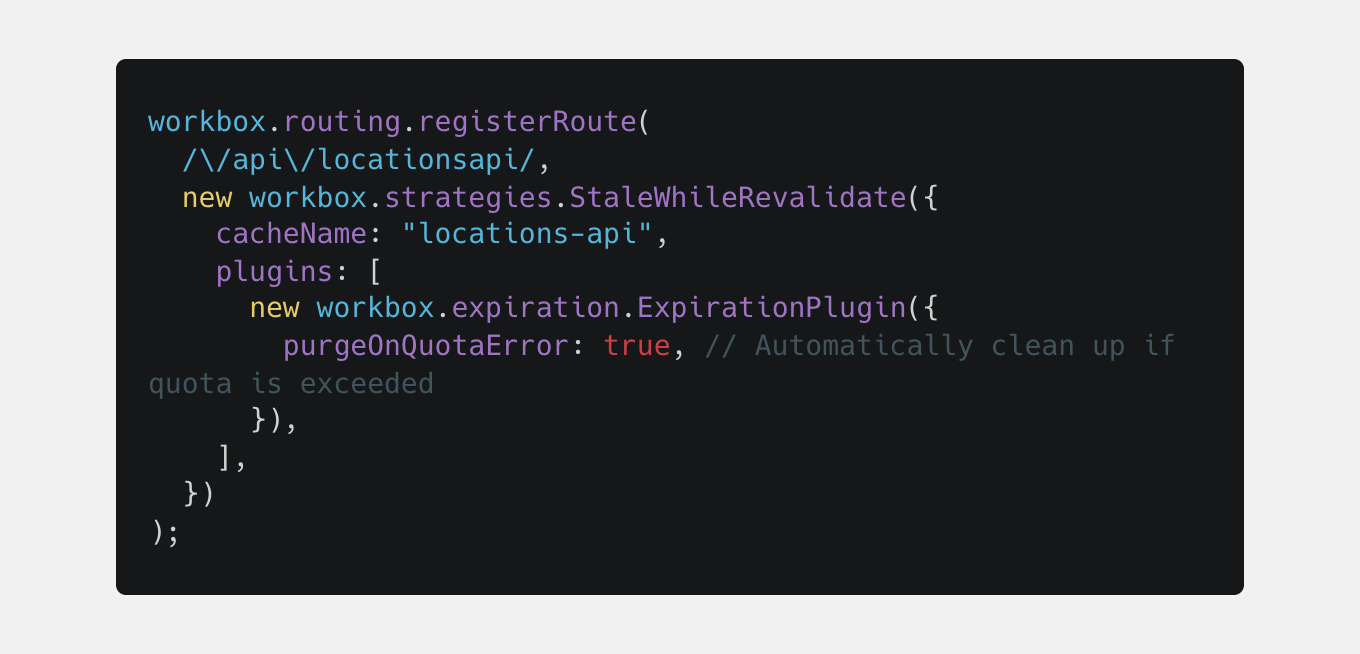
We send the minimal amount of resources for each page request using code-splitting (handled via our custom Webpack entry file) and lazy-loading JavaScript modules for those components that need attached functionality. At some point, we were also pre-caching some of the resources using Workbox when one of the design iterations introduced a carousel with five slides in the home page hero section, each slide having a video as a background. That component didn’t make it into production in the end, so we removed the service worker implementation as it turned out to have a negative impact on first time visits.
Example of pre-caching the data we use for the Locations page
Inlining critical CSS
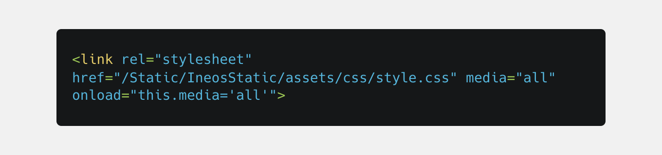
We use critical to extract and inline the home page’s critical CSS to improve Time to First Paint and then we lazy load the rest of the CSS.
Preconnecting to external 3rd party resources and preloading assets required for the critical path
Font loading was one of the big challenges as we still needed to load two different font families, each with five variants (font weights). We adopted a ‘two-stage’ font-loading strategy where we preload a subset of the main font that we use for the initial rendering and then lazy load the other required font variants using a custom implementation via the FontFace API
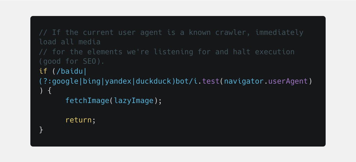
Lazy loading images not in the viewport
And progressively loading them when they are. We created a ‘scroll observer’ module, based on the IntersectionObserver API, that ‘watches’ when specific elements enter the viewport and starts loading the associated image either in an img tag or as a background image. A 200 px bottom rootMargin is added to our observer to ensure images get rendered right before they get into the viewport
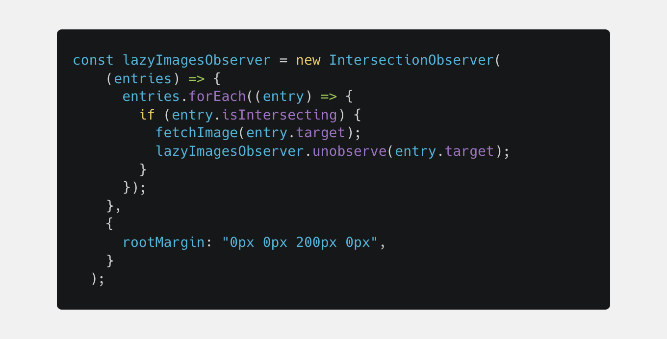
And to ensure our implementation is “SEO-friendly”, we load the images straight away for all major crawlers.
Compressing all images to reduce data transferred over the network
This was available through our Cloudinary implementation. All images rendered on the website are transformed via Cloudinary to ensure we serve the right size for each image and the right format, depending on browser support. Even if the editors upload huge JPG images, they will always get rendered as smaller, optimised WebP format images. And to fail-proof our implementation, in extreme cases when Cloudinary’s CDN might become completely unresponsive, we fallback to fetching and rendering the self-hosted images.
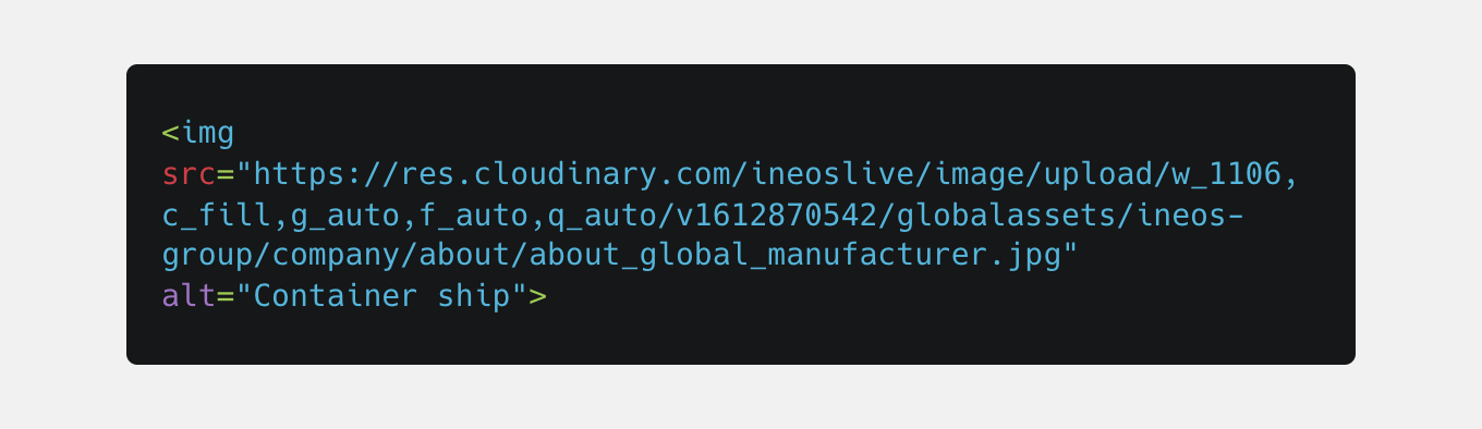
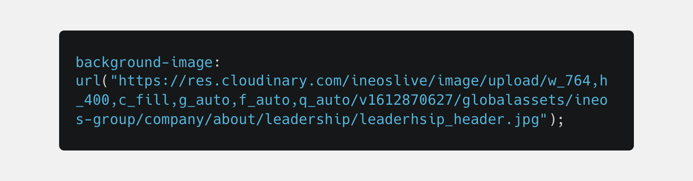
Example of image URLs that get loaded on ineos.com
As an img tag:
Or as a CSS background-image:
In this example, our ‘Container Ship’ image is a JPG that weighs 306kB, while the actual image rendered on the website is a WebP that’s only 46kB (more than 6x smaller file size).
And with the `f_auto` transformation added to our images, as soon as Cloudinary adds AVIF image format support, all browsers supporting this new format will render the images as AVIF delivering even bigger gains in image file size, without having to do any changes to our code.
Another major benefit of using Cloudinary is that all the image transformations are cached at CDN level. Once a transformation is applied to an image, that image will be available for any other users and fetched in no time.
A confident agile approach
Before we started work on any of the planned improvements, we wanted to create a standardised design system. Revising the look and feel of the website was a new project, so we took the opportunity to create a standardised set of UI components, patterns, layouts and CSS constants based on the new designs.
Having consistent designs allows us to iterate fast. We build each UI component just once, and reuse it in multiple places. For example, we have a feed component that can include either a list of page cards, news cards, document cards or download cards. We use it on the new home page, news and media page, search page, and many other places.
We are always mindful throughout the entire process to determine the appropriate performance trade-offs in any new frontend architecture. This allows us to aim as high as possible on the performance side, change old designs to conform to the new ones, and skip fancy animations if they are too expensive. All these elements are considered, while at the same time improving other aspects such as accessibility, following best practice and maximising SEO.
Benefits and Results
- 72% reduction in page load time.
- The Home Page now loads 3x faster than the old one.
- Only 2.7MB resources for the Home Page compared to 9.4MB for the old one.
- 50% total website traffic increase year-on-year
- 73% increase in organic traffic
- 36% reduction in bounce rate
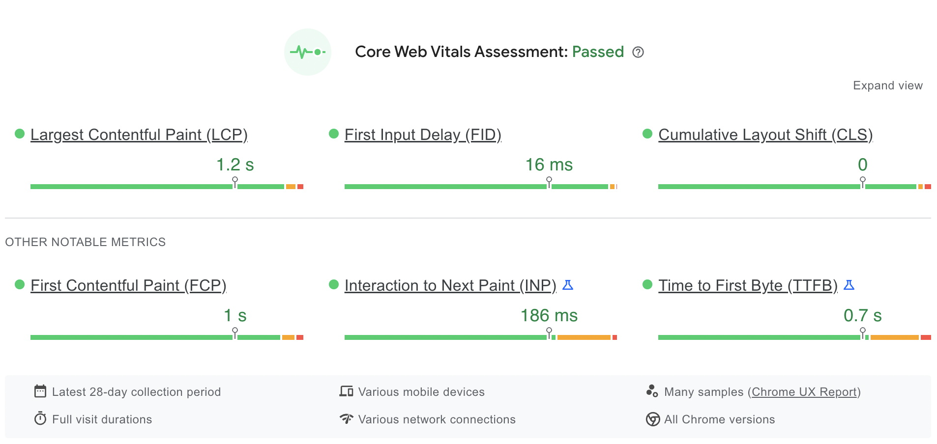
Google's Core Web Vitals audit didn't exist when we finished the implementation but due to our robust and future-proof frontend architecture and having best practices in place, when Google made the CWV available, achieving great scores on their metrics involved little to no effort from our developers.
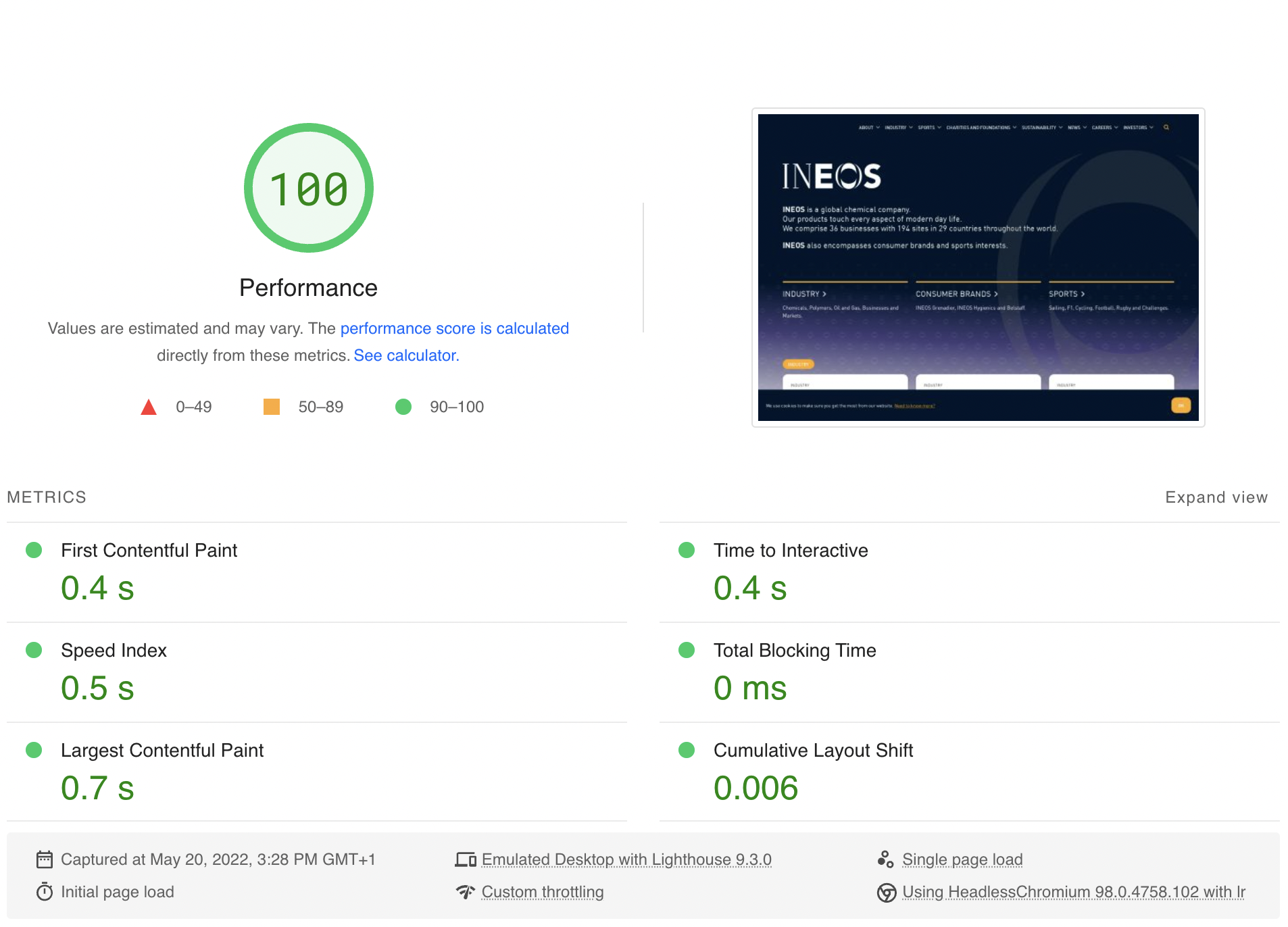
PageSpeed Insights provide a field data (real users) report for the last 28 days. All Core Web Vitals are all in the ‘green’ area.
And here is an overview of our Desktop Performance score and Desktop Core Web Vitals metrics according to the same tool.
Conclusion
What helped us stay fast
Having and enforcing the usage of our custom performance oriented build stack
Reducing critical rendering path down to the minimum
Auditing often with Lighthouse
What helped us move fast
Having a standardised design system and its corresponding library of UI components
Looking back on what we’ve done, we’re delighted with the new web experience and we’re working hard to make it even better.
We hope that this article has inspired you to consider performance when you're approaching the development of your next website.
If you’d like us to audit your website for Core Web Vitals and overall performance, don’t hesitate to get in touch or drop us an email at [email protected]