One Ocean 2

OneOcean

How we brought together Two leading Maritime brands Brand / Digital

The Business

OneOcean is the largest global supplier of voyage optimisation solutions for the maritime industry.

Formed from the merger of London-based ChartCo and Montreal-based Marine Press, it provides advanced, integrated digital navigation and regulatory compliance products to almost 20,000 vessels worldwide.

The Brief

Following the recent merger, OneOcean approached MTM with a complete branding and digital delivery requirement, looking for an integrated agency to support the development of a new visual identity and best-in-class website.

OO case study 1
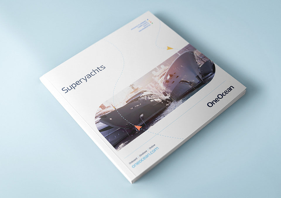
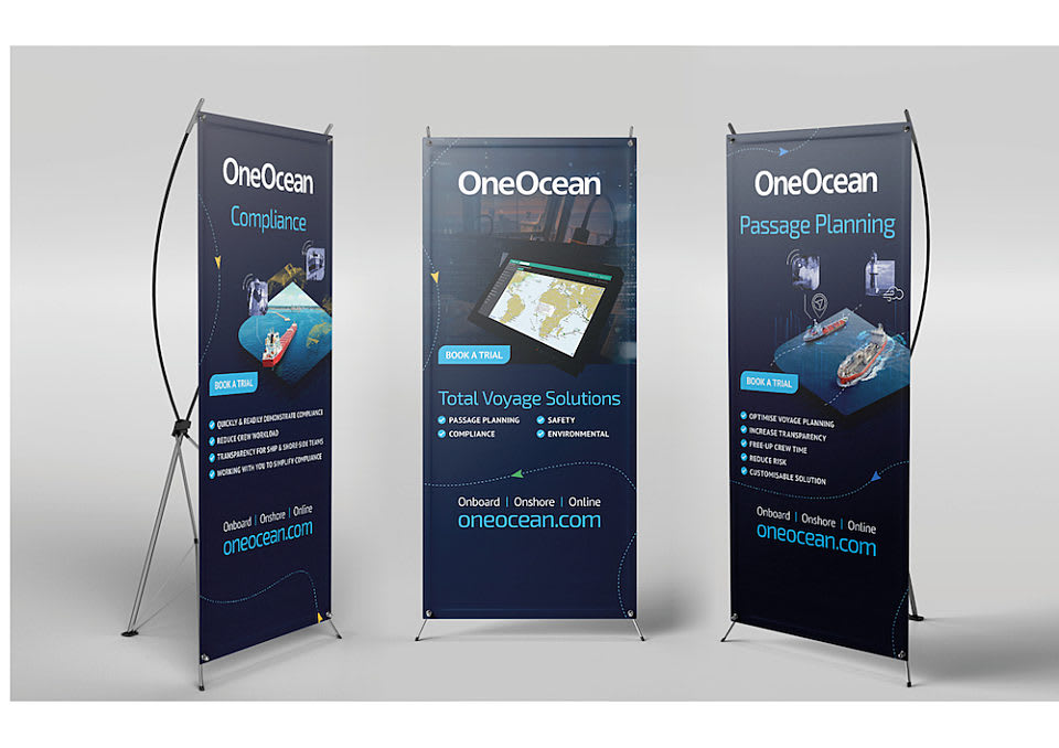
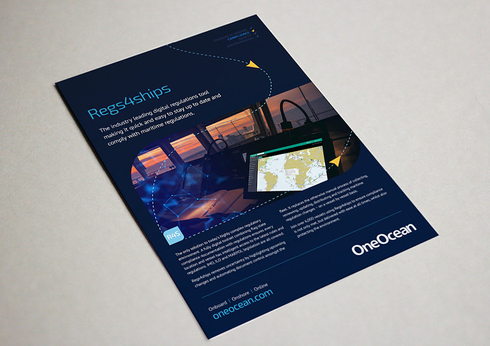
In addition to the new look and feel, the brief called for the development of a full suite of brochures and supporting marketing materials, including videos, a multi-channel social media content plan and related assets, event materials, presentations and much more.

The digital requirements included the design and build of a new company website, as well as defining OneOcean’s online tone of voice, language, messaging and all website copy. Technical aspects of the project included leveraging APIs to integrate the website with Salesforce and the OneOcean CRM.

Another key aspect of the brief was an awareness that historical brand associations – relating to printed, paper-based maps – were impacting OneOcean’s preferred positioning as an advanced digital software and data provider. The resulting project outputs therefore needed to work hard to define the business and its capabilities from the first interaction and ongoing.
OO Case Study 3

The Solution

Following extensive stakeholder engagement, including internal and external focus groups and one-to-one interviews with key decision-makers and product owners, MTM developed, collated, and presented our recommendations to the client.

Broken down into clear sections, with priorities and dependencies, we outlined our approach to each aspect of the project and provided the justifications for our decisions, using our primary and desk-based research. We highlighted the need for OneOcean to own the digital charts and compliance space by conveying a strong position of authority, retaining the use of direct, straightforward language, whilst also leveraging clean, simple design and well-defined layouts to ensure every aspect was easy to understand.
OO case study 2

Look and Feel

Visual elements needed to be distinct and unique, instantly recognisable as OneOcean but retaining the simplicity to be universally understood. The design of infographics to side by side the product descriptions needed to feel modern and sophisticated to match the advanced hi-tech nature of the solutions and to align with OneOcean’s preferred positioning as an innovative market and technology leader.

Our strategy for the website UX (user experience) focused on the audiences, understanding their requirements and uncovering how we would meet their needs. We wanted to drive high levels of engagement and conversation and to do that, we needed to have the right information, structured effectively, with a considered hierarchy to our messaging and key information presented clearly – supporting the user throughout their journey.
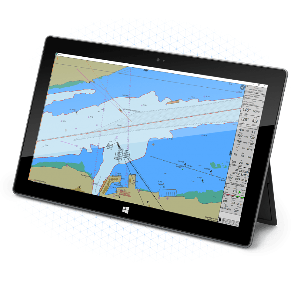
Sea Tab Portable Tablet

Technology

Increasing visitor numbers and return visits was naturally a key project objective, but we also wanted to support the larger goal of building a closer bond with OneOcean’s new and growing audience through greater understanding of the ‘how’ and the ‘why’. With this in mind, the newly proposed sitemap included specific landing areas and additional content pages for each of the new solutions.

Each section details the relevant application, technology, and features and benefits. Key information is communicated visually through an increased use of illustrations, diagrams and video to provide a more engaging experience and effective narrative. The existing and legacy product information was integrated into the relevant solutions areas so as to convey each solution’s constituent parts and to ensure our existing audience recognises familiar products.

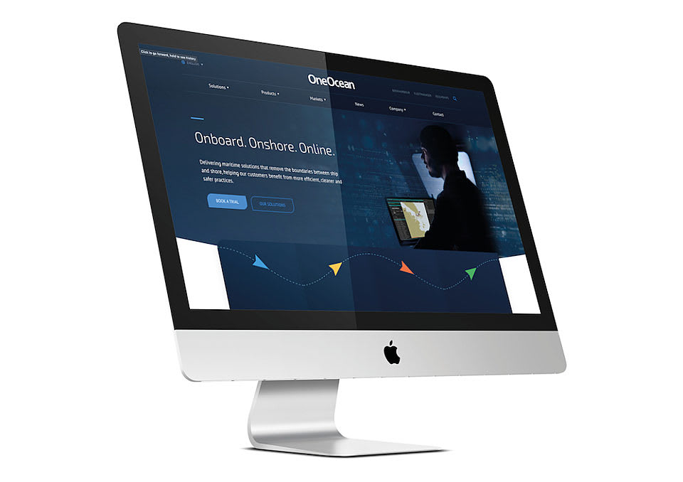
Applying the new branding and bespoke design to the new WordPress site, we developed a bespoke theme and provided a modern and clean overall look, as well as creating new functionality and improved user journeys, with greater emphasis on calls to action and signposting to key areas of the site.

Results

Now complete, the project was delivered on time and on budget and provides a public image for the brand that is reflective of its position, and with the flexibility OneOcean needs to meet their requirements both now and in the future.
OO case study 5
0000
Monthly traffic increase since launch (March 2020 vs Sept 2020)
0000
Site form conversion rate
0000
Bounce rate reduced

BOOK

Discuss your next digital project with our dedicated team.

Book now

NEWSPAPER

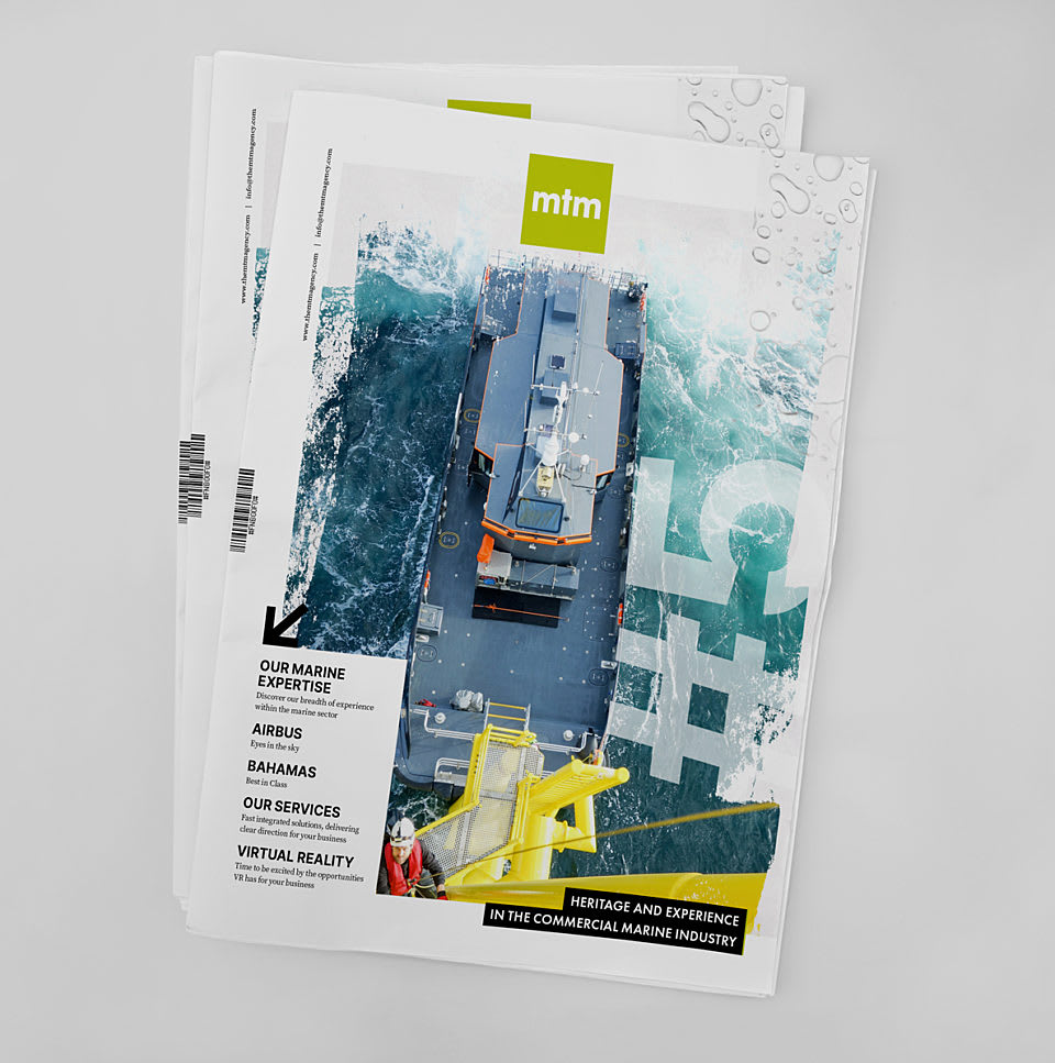
Download our Maritime Newspaper

Download
Newspaper Mockup 2